(Click on any photo to view a larger image.)
My sister Sue and brother-in-law Todd recently celebrated their 26th wedding anniversary and the event was marked with a family dinner hosted by my parents at their home. It was a simple affair to mark a grand achievement, one that I thought deserved a souvenir to commemorate the special occasion so I decided to create something that would be a lasting reminder of the day they got married. To that end I created coordinating corsages for the two of them. (Oh, I know that men aren't "supposed" to wear corsages but what is a boutonniere if not a very small corsage?)
The corsages are created with a mix of miniature roses I made myself and manufactured elements in a gold and white color scheme. Her corsage features a small narrow ribbon bow imprinted with the words "Mr. and Mrs." and a white dove perched on the side of the golden bow. His smaller corsage features two golden rings affixed on the white plume just above the roses.
I also made corsages for my parents, the host and hostess. My mother loves all things green so her little roses are pale green with matching ribbon bows. My father's corsage is blue and white.
Seems I haven't stopped making paper flowers for a year now, starting with that massive floral project I did for my daughter's graduating class in 2010. Funny thing is that the more I make them, the more I like making them. I guess there are more flowers in my future for sure.
Ballo ergo sum
- Gitana, the Creative Diva
Design team member for About Art Accents
Thursday, April 14, 2011
Sunday, April 3, 2011
Bloom or Bust: The Celebration of Spring Begins
| Stylized hydrangeas |
This has been a rather productive weekend for me. And well it should. After all, I sequestered myself in my basement workroom on Saturday for 15 hours, breaking only long enough to eat (such a bad habit), go to the bathroom (another time waster) and play the occasional computer game to take a break (time well spent).
| Detail of Floral Border Panels |
One of the things I do at the Dorchester Senior Citizens Center where I volunteer is to seasonally decorate the main activity room.
This weekend I decided to create flowers...lots of them...for the purpose of decorating the center for spring. I was inspired by a recent purchase of craft foam flowers intended for a young child's craft project to create some colorful border panels to be placed along one of the center's walls above eye level. As I was putting the flowers together as intended by the manufacturer, I realized there was so much more that I could do to make them more interesting so I colored, scored, folded, and glued. The more I embellished, the more invested I became in the project and the more pleased I was with what was taking shape. Here you can see some photos of the four border panels I completed this weekend as well as some stylized hydrangea blossoms that were running around in my head, begging to be created.
Ballo ergo sum
- Gitana, the Creative Diva
Design team member for About Art Accents
Thursday, March 10, 2011
Keeping Busy and Some Great News!
(Click on any photo to view a larger image.)

Although it has been a while since I have posted anything about my senior citizens crafting group, it hasn't been because nothing is happening. In fact quite a bit has happened. The frequent snows of January seemed to fall on the day before or on the day of a crafting class necessitating closure of the center on those days. There was a span of three weeks during which no classes took place because of the weather but we made up for it. Here are some photos of the projects we did on the days that Mother Nature wasn't having a hissy fit.
We created a luminaria votive holder during the first week of January to start the new year off with light. February was met with a Valentine's Day hanging ornament. True story: this project was designed and prepared for last year's Valentine's Day but what do you suppose happened on the day the class was supposed to meet? Yep, it snowed. By the time we met the following week, Valentine's Day had passed so I had to keep the project under wraps until this year. We just narrowly missed being snowed out again but the weather held out.


Taking a short break from paper crafts, we indulged in some light beadwork and created a key ring with wooden beads and a little tassel. Another day we tried invoking the spirit of spring by creating cards with simple origami tulips.
March brings us St. Patrick's Day so the ladies and I made some hanging shamrocks to adorn the center. For this project I brought in some of my crafting toys...paper crimpers, my Cuttlebug and some embossing folders. I also brought in rub-on colors by Craf-T, gifts that I snagged during my trip to the CHA Supershow in July 2010. The group added texture to the various elements of their ornaments and then used the rub-on colors to highlight the embossed edges. Embossing and colored highlights added an extra dimension to a very simple project.
Here's a peek at the project we'll be doing this week. It's a tri-fold card with a ribbon tie on the side and an embellished envelope. It opens to reveal ample space for a personalized note or even a photograph. I didn't have any envelopes to match so I had to make my own using text weight paper. I also didn't have the right kind of envelope glue for the flap so I used a "sticky note" glue, the light tack re-positionable kind used to make sticky notes. Thanks to my paper cutter and scoring tool for making that task a little easier to manage.
Now here's the great news I alluded to in the title of this post. In September I applied for grant money to continue the work I've been doing at the senior center. I'd never applied for a grant before and figured a first time applicant probably didn't have a chance at be awarded any funding. Imagine my shock when I received a letter in January congratulating me on being an awardee! This money will allow me to purchase supplies to keep the crafts program alive and expand into other areas of interest such as jewelry making. The funds will be distributed in late March and I'm already scouring catalogs and hatching ideas. I'm off and running.
Ballo ergo sum
- Gitana, the Creative Diva
Design team member for About Art Accents
Although it has been a while since I have posted anything about my senior citizens crafting group, it hasn't been because nothing is happening. In fact quite a bit has happened. The frequent snows of January seemed to fall on the day before or on the day of a crafting class necessitating closure of the center on those days. There was a span of three weeks during which no classes took place because of the weather but we made up for it. Here are some photos of the projects we did on the days that Mother Nature wasn't having a hissy fit.
Taking a short break from paper crafts, we indulged in some light beadwork and created a key ring with wooden beads and a little tassel. Another day we tried invoking the spirit of spring by creating cards with simple origami tulips.
March brings us St. Patrick's Day so the ladies and I made some hanging shamrocks to adorn the center. For this project I brought in some of my crafting toys...paper crimpers, my Cuttlebug and some embossing folders. I also brought in rub-on colors by Craf-T, gifts that I snagged during my trip to the CHA Supershow in July 2010. The group added texture to the various elements of their ornaments and then used the rub-on colors to highlight the embossed edges. Embossing and colored highlights added an extra dimension to a very simple project.
Here's a peek at the project we'll be doing this week. It's a tri-fold card with a ribbon tie on the side and an embellished envelope. It opens to reveal ample space for a personalized note or even a photograph. I didn't have any envelopes to match so I had to make my own using text weight paper. I also didn't have the right kind of envelope glue for the flap so I used a "sticky note" glue, the light tack re-positionable kind used to make sticky notes. Thanks to my paper cutter and scoring tool for making that task a little easier to manage.
Now here's the great news I alluded to in the title of this post. In September I applied for grant money to continue the work I've been doing at the senior center. I'd never applied for a grant before and figured a first time applicant probably didn't have a chance at be awarded any funding. Imagine my shock when I received a letter in January congratulating me on being an awardee! This money will allow me to purchase supplies to keep the crafts program alive and expand into other areas of interest such as jewelry making. The funds will be distributed in late March and I'm already scouring catalogs and hatching ideas. I'm off and running.
Ballo ergo sum
- Gitana, the Creative Diva
Design team member for About Art Accents
Monday, February 14, 2011
Paper Craft Planet Sketch Challenge
(Click on photo to view a larger image.)
When I was first becoming a part of the online stamping community I used to participate in many swaps and challenges. As my life became busier I had to pull away from swaps in order to free up some time. My life hasn't become any less busy...if anything it has become busier...but I decided to try my hand at the weekly challenge posted this week at Paper Craft Planet. The layout couldn't be any simpler and I thought this would be a great way to showcase a focal stamp. I've chosen the same pensive mermaid stamp I used in my underwater ATC series. I really have a good time coloring in her beautiful tail and long hair.
Materials:
Mermaid Stamp: Seaside Dreamer- Faerie Song Art Stamps FS-10SD
Seaweed Stamp: Me and Carrie Lou Stamps
Versafine Onyx Black Ink (for stamping mermaid image)
Versamark Watermark Ink (for stamping the seaweed image)
Gold PearlEx (lightly dusted over the Versamark stamping)
Krylon Gold Paint Pen (for gilding the edges)
Krylon Matte Low Odor Clear Finish (to prevent smudging and loss of PearlEx dusting)
Ballo ergo sum
- Gitana, the Creative Diva
Design team member for About Art Accents
When I was first becoming a part of the online stamping community I used to participate in many swaps and challenges. As my life became busier I had to pull away from swaps in order to free up some time. My life hasn't become any less busy...if anything it has become busier...but I decided to try my hand at the weekly challenge posted this week at Paper Craft Planet. The layout couldn't be any simpler and I thought this would be a great way to showcase a focal stamp. I've chosen the same pensive mermaid stamp I used in my underwater ATC series. I really have a good time coloring in her beautiful tail and long hair.
Materials:
Mermaid Stamp: Seaside Dreamer- Faerie Song Art Stamps FS-10SD
Seaweed Stamp: Me and Carrie Lou Stamps
Versafine Onyx Black Ink (for stamping mermaid image)
Versamark Watermark Ink (for stamping the seaweed image)
Gold PearlEx (lightly dusted over the Versamark stamping)
Krylon Gold Paint Pen (for gilding the edges)
Krylon Matte Low Odor Clear Finish (to prevent smudging and loss of PearlEx dusting)
Ballo ergo sum
- Gitana, the Creative Diva
Design team member for About Art Accents
Tuesday, February 8, 2011
Underwater Fascination
(Click on any photo to see a larger image.)

I was so taken with the ATC's I created in my last two posts (Siren of the Sea and Snowball Koi) that I continued the underwater theme and created two more.
The Purple Betta presented a challenge to me because of it's orientation. It is a long, relatively slender stamp measuring only one and a half inches across. The fish's tail is effectively cut off giving the impression that perhaps I did a poor job of trimming the image. I didn't know quite where to place it on an ATC and finally settled on a centered orientation within a golden gothic-style arch, flanked by seaweed images dusted with two colors of PearlEx.
The beautiful Pensive Mermaid is my new favorite. I am particularly proud of my rendering of the light flltering through the water from the top of the frame and the resulting shadows. As opposed to the Siren of the Sea, I chose to make this mermaid a uniform color from head to tail so you can't necessarily see where the woman ends and the fish begins. The richly colored shading is done by careful layering and blending of Prismacolor pencils. I know I'll be making more images of this stamp and playing with different color combinations for the hair and scales.
I would really like some constructive criticism on these ATC's. I would also like to find a source for beautiful mermaid images like the two I have used in this series. If you happen to know of any, by all means drop me a line and let me know. Thanks.
Ballo ergo sum
- Gitana, the Creative Diva
Design team member for About Art Accents
I was so taken with the ATC's I created in my last two posts (Siren of the Sea and Snowball Koi) that I continued the underwater theme and created two more.
The Purple Betta presented a challenge to me because of it's orientation. It is a long, relatively slender stamp measuring only one and a half inches across. The fish's tail is effectively cut off giving the impression that perhaps I did a poor job of trimming the image. I didn't know quite where to place it on an ATC and finally settled on a centered orientation within a golden gothic-style arch, flanked by seaweed images dusted with two colors of PearlEx.
I would really like some constructive criticism on these ATC's. I would also like to find a source for beautiful mermaid images like the two I have used in this series. If you happen to know of any, by all means drop me a line and let me know. Thanks.
Ballo ergo sum
- Gitana, the Creative Diva
Design team member for About Art Accents
Thursday, February 3, 2011
Continuing a Creative Experiment
I enjoyed creating the Siren of the Sea ATC in my last post so much that I decided to create another undersea ATC, this time featuring koi fish.
Starting with a slightly mottled cream colored base, the focal image is stamped in Versafine black ink which really brings out the details in any stamp. It is then masked and the background is sponged in various shades of blue ink from dark to light. The large seaweed to the lower left is also stamped in Versamark black, then the mask is removed and the fish are colored in with Prismacolor pencils and highlighted with glittery gel pens for a little sparkle. The seaweed is over-colored in dark green pencil.
The original image was ATC sized, that is to say 2.5 inches by 3.5 inches, but it looked a bit dull and uninteresting. I had the idea to trim it down by clipping the corners with a decorative corner slot punch to create the curves and notches and cutting from one corner notch to the next with a craft knife. The result is the lantern-like shape you see above. I placed it on a dark blue base card and gilded all the edges with a gold paint pen.Gold stickers in the corners highlight the edges and the sparkle in the scales and fins. The contrast with the navy blue base card and the shine of the gold brought a dull card to life and made the image pop. I'm happy with the way this ATC turned out and I am already looking for the next image with which to play.
Materials:
2 Snowball Koi - About Art Accents
Seaweed Foliage - Magenta Rubber Stamps
Gold Stickers - Starform Stickers
Corner punch - EK Success Paper Shapers Card Creator Decorative Corner Slot Punch
Dye inks - Vintage Blue (Whisper Ink), Baby Blue (Memories), Denim (Adirondack), Onyx Black (Versafine)
Prismacolor Colored Pencils - various
Ballo ergo sum
- Gitana, the Creative Diva
Design team member for About Art Accents
Sunday, January 30, 2011
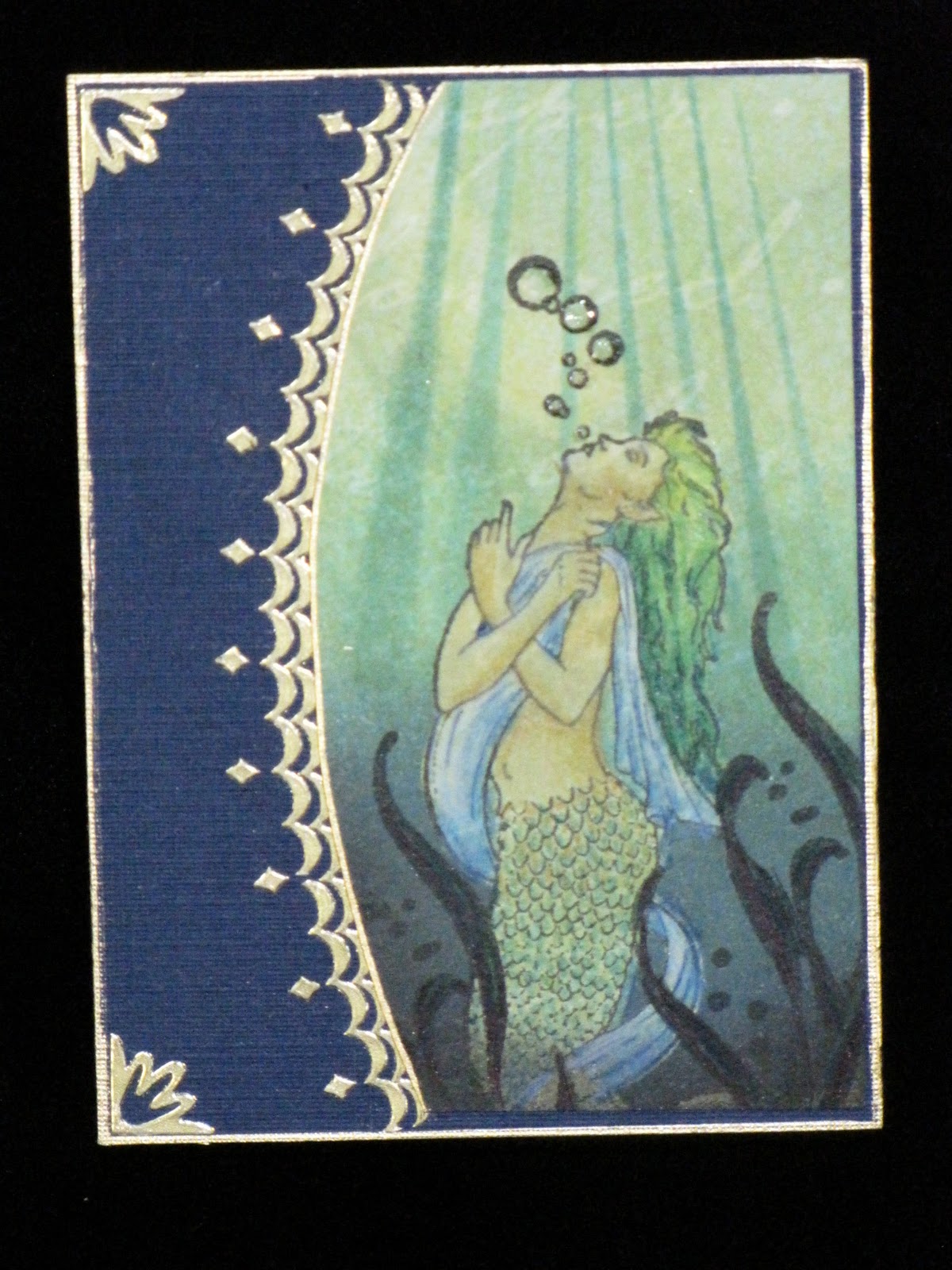
Siren of the Sea ATC
I like Artist Trading Cards (ATC) because they are small (2.5 x 3.5 inches) which means that they work up more quickly than a standard card. Since there isn't a lot of room to work with, it is best not to clutter it up with a lot of busy-ness. This provides the perfect canvas for me to try out new ideas and techniques without investing a lot of materials in the process. In spite of the fact that I like ATC's so much, it has been a year since I've made one, so busy have I been with a hundred and one other things.
It was a real treat to make this one because I was working on a new idea. I wanted to continue exploring the interplay of light and shadow that I had begun several months ago when I created my Night Flight series of cards using supplies I had gotten from the CHA Crafts Supershow in Illinois last summer. I have always liked the way light filters through deep water, particularly the way it illuminates a small section of the water while everything else is shadowy and murky. I wanted to try my hand at creating the suggestion of light rays shining through water and the shadows beyond the light's reach. This ATC was my second attempt and although I'm still not satisfied with the way the mermaid looks, I like the overall effect enough that I'll keep working at this until I get something I really like.
Working on a base of pale green card stock with slight variations in color saturation, I sponged various inks to create the gradations of color in the background. The rays were achieved with masking and sponging. The masking technique was also used on the mermaid to prevent her from being contaminated with background ink. The image was colored with a variety of media: colored pencils, inks and markers. Cutting the left edge of the image into a curve was a last minute decision as was placing the image to the right. The original design was all straight edges and left aligned. I like this much better. The gold embellishments are carefully and strategically placed stickers.
Mermaid stamp: "Sea Siren" - Faerie Song Art Rubber Stamps
Seaweed stamp: Me and Carrie Lou Stamps
Background paper: Enchanted Complements Moonlight Lime - The Crafter's Workshop
Base card: "Navy" - Cardstock Warehouse
Stickers: Starforms Outline Stickers
Ballo ergo sum
- Gitana, the Creative Diva
Design team member for About Art Accents
Working on a base of pale green card stock with slight variations in color saturation, I sponged various inks to create the gradations of color in the background. The rays were achieved with masking and sponging. The masking technique was also used on the mermaid to prevent her from being contaminated with background ink. The image was colored with a variety of media: colored pencils, inks and markers. Cutting the left edge of the image into a curve was a last minute decision as was placing the image to the right. The original design was all straight edges and left aligned. I like this much better. The gold embellishments are carefully and strategically placed stickers.
Mermaid stamp: "Sea Siren" - Faerie Song Art Rubber Stamps
Seaweed stamp: Me and Carrie Lou Stamps
Background paper: Enchanted Complements Moonlight Lime - The Crafter's Workshop
Base card: "Navy" - Cardstock Warehouse
Stickers: Starforms Outline Stickers
Ballo ergo sum
- Gitana, the Creative Diva
Design team member for About Art Accents
Saturday, January 29, 2011
Baby Bananas
(Click on any photo for a larger image.)
Recently I attended a baby shower to welcome the newest member of our family, a beautiful baby boy born to my second cousin, Melissa. For her baby registry she had chosen all the sheets, clothes and accessories in a Jungle Babies pattern featuring tiny jungle animals. In keeping with this theme I created this banana tree scene in which to wrap the baby gifts my sister and I had purchased.
The bananas contain the baby clothes. Each individual piece of clothing was folded and rolled up jellyroll style with a floral wire in the middle. Then it was rolled up in tissue paper, the ends secured and several of them tied together to resemble a bunch of bananas. The three dimensional tree is built on a brown paper-wrapped box that contains another gift. The ends and sides of the fruit crate were covered with personalized labels I designed in a drawing program. The little monkey was inspired by the monkeys on the clothing, What you can't see is what's inside the crate hiding under the paper grass...baby hangers to hold all the clothes! The monkey, the bananas in the bunch hanging from the tree, and the leaves on the tree were all created in a drawing program, saved as .svg graphic files and cut with the eCraft electronic cutter.

If you are interested in how I created the "baby bananas", just drop me an email and I'll send you instructions. (Note: Instructions are for the tissue wrapped bananas only. The tree, monkey, etc. are not included.)
Thanks for stopping by.
Ballo ergo sum
- Gitana, the Creative Diva
Design team member for About Art Accents
Recently I attended a baby shower to welcome the newest member of our family, a beautiful baby boy born to my second cousin, Melissa. For her baby registry she had chosen all the sheets, clothes and accessories in a Jungle Babies pattern featuring tiny jungle animals. In keeping with this theme I created this banana tree scene in which to wrap the baby gifts my sister and I had purchased.
If you are interested in how I created the "baby bananas", just drop me an email and I'll send you instructions. (Note: Instructions are for the tissue wrapped bananas only. The tree, monkey, etc. are not included.)
Thanks for stopping by.
Ballo ergo sum
- Gitana, the Creative Diva
Design team member for About Art Accents
...and Jill came tumbling after.
(Warning! Graphic image.)
Something happened to me on Sunday night, 1/23/11, that although it occurred frequently during my younger years, it hasn't happened to me in a long, long time. I fell down a flight of stairs. The basement stairs, to be precise. It all happened so quickly it was like a blur. One moment I was at the top of the stairs speaking to my husband then the other I was at the bottom of the stairs, having slid down its entire length on my left leg. I remember turning away from my husband as we finished our conversation. He closed the door at the top of the stairs and was heading for the living room. I turned to descend to my basement work room, and that's all I can clearly remember other than the sound of thump-thump-thump-thump as my body collided with the edge of every step from the top to the bottom. Oh yeah, and there was also the sound of me yelling on the way down.
I was fortunate on a number of counts. 1) My husband was still close enough that he heard the whole thing and was able to help me up immediately after the fall, and 2) I didn't hit any bones on the way down else I surely would have broken something. This was one time I was grateful for the extra junk I have in my trunk because it cushioned what could have been a disaster. The pain was immediate and very short lived although the bruising...well, let's just say if bruising was an Olympic sport I would have made it to the podium. The image you see here is what it looks like 5 days after the accident. It's already beginning to heal as evidenced by the areas of angry red surrounded by dark purple. It took a full 24 hours for the bruising to fully bloom. I'll be seeing a doctor soon and will have myself looked over thoroughly to make sure nothing else is going on inside that needs medical attention.

In spite of it all I've been smiling like a champ. Why? Because I recognize just how lucky I was not to have been seriously injured. Because I feel as if I have just dodged a bullet. Because I know that no matter how bad this bruise looks, in time it will heal and I will be fine.In the past few weeks I have had the sad task of visiting an old friend in hospice. Her days are nearing their end. Compared to her I am the picture of health. So with that in mind I'll take the bruises, I'll learn the lessons and I'll be thankful for every single day I have on this earth.
Life is short. Live it.
Ballo ergo sum
- Gitana, the Creative Diva
Design team member for About Art Accents
Something happened to me on Sunday night, 1/23/11, that although it occurred frequently during my younger years, it hasn't happened to me in a long, long time. I fell down a flight of stairs. The basement stairs, to be precise. It all happened so quickly it was like a blur. One moment I was at the top of the stairs speaking to my husband then the other I was at the bottom of the stairs, having slid down its entire length on my left leg. I remember turning away from my husband as we finished our conversation. He closed the door at the top of the stairs and was heading for the living room. I turned to descend to my basement work room, and that's all I can clearly remember other than the sound of thump-thump-thump-thump as my body collided with the edge of every step from the top to the bottom. Oh yeah, and there was also the sound of me yelling on the way down.
I was fortunate on a number of counts. 1) My husband was still close enough that he heard the whole thing and was able to help me up immediately after the fall, and 2) I didn't hit any bones on the way down else I surely would have broken something. This was one time I was grateful for the extra junk I have in my trunk because it cushioned what could have been a disaster. The pain was immediate and very short lived although the bruising...well, let's just say if bruising was an Olympic sport I would have made it to the podium. The image you see here is what it looks like 5 days after the accident. It's already beginning to heal as evidenced by the areas of angry red surrounded by dark purple. It took a full 24 hours for the bruising to fully bloom. I'll be seeing a doctor soon and will have myself looked over thoroughly to make sure nothing else is going on inside that needs medical attention.
In spite of it all I've been smiling like a champ. Why? Because I recognize just how lucky I was not to have been seriously injured. Because I feel as if I have just dodged a bullet. Because I know that no matter how bad this bruise looks, in time it will heal and I will be fine.In the past few weeks I have had the sad task of visiting an old friend in hospice. Her days are nearing their end. Compared to her I am the picture of health. So with that in mind I'll take the bruises, I'll learn the lessons and I'll be thankful for every single day I have on this earth.
Life is short. Live it.
Ballo ergo sum
- Gitana, the Creative Diva
Design team member for About Art Accents
Tuesday, December 28, 2010
Last Minute Christmas Cards
Ok, I admit it. I didn't send Christmas cards this year. Heck, I barely bought any gifts. There was just too much going on for me to sit down long enough to create my annual masterpiece to send out to everyone. To be very honest I felt a bit empty and let down about it because I really wanted to craft cards but Time is a hard task master and refused to relent in my favor.
The cards on this page represent all the cards I made early (like between 2AM and 6 AM early) on Christmas morning. With the exception of the curly purple tree on the top card and the hand drawn holly border on the white card to the left all of the elements used here were found in my RTU stash. A gilded border here, a rhinestone there and VOILA!, a card is born. Granted, the creativity quotient may have been somewhat lower than what I would have liked but it was preferable to a store bought card or (horrors) no card at all. Next year I'll have to start my cards earlier. Yeah, that sounds like a plan.
Ballo ergo sum
- Gitana, the Creative Diva
Subscribe to:
Posts (Atom)