Thursday, March 8, 2012

Blockhead Stamps Banner Ad

I'm not one given to placing random ads on my blog so when I choose to do so there had better be a good reason. In the right column you'll notice a new ad from Blockhead Stamps. A couple of years ago I submitted some of my work to one of their creative challenges. I didn't win but the owner liked my work so much she asked if I would be willing to create some pieces using Blockhead Stamps that she could use as part of her display at shows. I agreed and got to choose any stamp set they offered for my work. I chose Inspired by Nature. Here you see a card I make with this stamp set using a bleach technique on watercolor paper. The background was misted with a variety of liquid watercolors, the images were stamped with a permanent solvent ink, then the color inside the images was removed using a bleach pen. After the color was lifted out, it was replaced using watercolor pencils. The butterfly was stamped on and cut from a separate piece of  paper and attached with its wings raised up as if in flight.

The entire exchange with the owner of Blockheads was friendly, supportive and professional and left me with a very positive impression. So when I read on Blockheads' blog page that there was a one in ten chance of winning a stamp just for placing the banner on my page, I jumped at the chance to win a prize as well as show my appreciation for a great company to do business with.

If you haven't checked out the wonderful stamps and other crafting supplies they have available, give Blockheads Stamps a look-see.

Ballo ergo sum
- Gitana, the Creative Diva

Saturday, February 25, 2012

"The time has come", the walrus said...

(Click on photo to see a larger image.)

"...to talk of many things."  Even someone unfamiliar with Lewis Carroll's classic poem, "The Walrus and The Carpenter", has heard those words before. I will do exactly that...talk of many things.

It is with a heavy heart and a tinge of regret that I have made the decision to suspend my craft classes at the senior citizens center. My weekly craft projects have become extremely time consuming and I have other responsibilities that demand my attention. It has become increasingly difficult to come up with a project each week that is simple enough for even the most challenged seniors to complete, interesting enough to hold their attention and diverse enough so that they are not doing the same thing over and over again. Yet there is another, more intangible, reason. I'm feeling jaded and I no longer feel the same anticipation and joy I once did. These are but some of the reasons I must leave my beloved senior ladies.

Here you see a photo of the final project I will be doing with them. It is a card utilizing simple elements on a printed card front. The beautiful designs on these cards make simple die cut shapes and a decorated garment tag take on a more sophisticated look. This will be one of those projects where the ladies will get to choose their own pieces as opposed to having me create individual kits for them. The cards are double sided with an ornate design on one side and a more subtle and subdued pattern on the other side, giving them two options to choose for a card front. The embellishments will all be placed on the table for them to choose from and if I know my ladies they will all be choosing a different mix. With this, their final craft project with me, they will be allowed to demonstrate their own personal creativity and flair. I, for my part, will be photographing them as usual, capturing their moments of cooperation and their smiles.


Ballo ergo sum
 - Gitana, the Creative Diva

Saturday, February 11, 2012

Going with the Flow

(Click on any photo to see a larger image.)


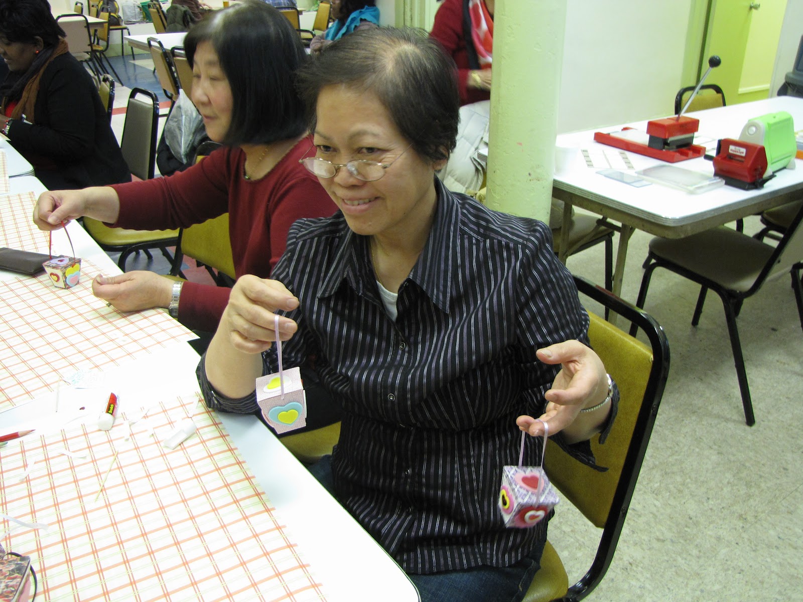
The final Valentine's Day craft class took place at the senior center this week and once again I decided on a bit of a departure from the norm. I was going to have the ladies craft little treat boxes shaped like miniature Chinese food take out containers.
Although we have made little treat boxes before, this time I left a lot of the work up to the seniors. I cut out all the pieces as usual but I didn't package everything into neat little kits. Instead I spread everything out on the table in boxes and let them choose whatever pieces they wanted to decorate their boxes. I also brought along a few "toys" for them to play with -- embossing machines and embossing folders. This allowed them to press raised designs onto paper panels that they then glued onto the sides of their boxes. I demonstrated how to use the machines and also showed them how to color their embossing with the side of a colored pencil to highlight the raised designs. I provided them with charts illustrating the available designs they could choose from and then I let them loose.
Oh boy, did they get a kick out of that! I thought they would be a little annoyed at having to get out of their seats and walk over to the adjoining table where the machines were but not only did they not get annoyed, they were having a ball choosing designs and using the machines. A few of them were very enthusiastic about the project. Fortunately I had made double the usual number of projects because the boxes were very small and because I wanted them to make one for themselves and another one to give away to a someone they loved. And, of course, what is a treat box without some treats? When they completed their boxes, I filled them with candy! The class lasted much longer than the usual 45  minutes to an hour but no one seemed to mind a bit, least of all me. 

The preparation for this class took quite a lot of time and those embossing machines and supplies were REALLY heavy (I needed a rolling bag to carry them) but we had such a good time that it was all worth it. As the class was ending, one of the ladies gave me one of her completed, candy-filled boxes. I thought it was such a sweet gesture and it gave me a big smile. 

After each class, it is my practice to take the prototype I create for the project and place it in the display case with the other class projects. In this manner there is a constantly changing display with older pieces being replaced by newer ones and I get to look over all the work we've done in the past. This week when I added to the display, something had changed. It was as if I was seeing all those pieces for the very first time through a new set of eyes. I was taken aback by the true beauty of it all and I had to hold back emotional tears of joy. 

It's funny how you can be so close to something that you don't really see it. 


Ballo ergo sum

- Gitana, the Creative Diva

Wednesday, February 1, 2012

An Unconventional Valentine's Day Card

(Click on the picture to view a large image.)
2012 - a dramatically different color scheme
When you think of Valentine's Day, you think of pink and red hearts, right? Yeah, me too, but this year I wanted to do something a little different for my seniors. Our Valentine's Day projects for the past two years, as seen below, have included the mandatory red and pink hearts. This time I wanted to give an unexpected twist to our craft project. While this year's card sports the obligatory hearts and flowers my ladies know and love, the color scheme is anything but conventional. Inspired by a beautiful piece of specialty paper in shades of turquoise and purple , I designed a card that really played up those colors. I will admit that, at first, I wasn't too thrilled with the way this card was turning out but the more I worked on it, the more it grew on me and now I'm very pleased with the final outcome.

Our very first project from 2010
2011's hanging ornament
The colors are not the only things different about this card. You can't really tell from the photo but this is not a foldover card, it's an insertion card. What I mean is that there is only a front and a back to this card, like a postcard. It doesn't open up. You have to turn it around to see what is written on the other side. This will be a bit of a departure for these ladies accustomed to the more conventional type of card.

For this project I had my DrawPlus graphic software and my eCraft electronic cutter working overtime. The heart is crafted of four different layers stacked upon one another. Each of these layers had to be designed and cut separately. It took quite a few attempts to get the lighter blue trellis-like layer to cut correctly, after which I had to manually poke out all the little holes in between the mesh. Once the heart was completed, cutting the rest of the card elements was a piece of cake. The tiny tag was just the perfect size for a kiss print rubber stamp that I've had for the longest time. I deliberately left off any overt references to Valentine's Day because I wanted this project to convey the universal aspect of love over the celebration of one calendar day. This card could just as easily be used to congratulate a newly engaged couple or be sent as a quick hello to a cherished grandchild. Although I admit that the swirls and flowers lend a very feminine air, the color scheme would suit a young man. I'm sure the ladies will love it.

Ballo ergo sum
- Gitana, the Creative Diva

Saturday, January 28, 2012

Sipping from the Well

(Click on  photo to view a larger image. Then click back button to return to this post.)

It seems like such a long time since I've sat down to create a card solely for myself, not because I had to create a project for the seniors or had some upcoming event that needed a gift card but something purely to soothe my creative beast. A recent trawl on various websites allowed me to drink in the beauty of and draw inspiration from the artistic work of others.

I truly love the simplicity of black and white, silhouette images and bare hints of color so I created the cards at right using elements composited from other cards I found online. The butterfly is an SVG cut file I created for my eCraft electronic cutter. It's body is glued down and embellished with rhinestone trim while the wings are lifted up off the paper giving a three dimensional effect. The stamped swirls were created using Inkadinkado's Flourishes clear stamp set 97618. Tim Holtz's distress inks (Old Paper, Crushed Olive) and Memories dye ink (Baby Blue)  were used to add the subtle color around the edges of the white paper. The tiniest rhinestone bling I could find was used to accent the corners of the butterfly square and a few curlicues in the swirls. A black satin ribbon tied in a bow pulls the whole thing together.

It was immensely satisfying to work solely for myself. I certainly hope to do more of this in the near future.

Ballo ergo sum
- Gitana, the Creative Diva

Friday, January 27, 2012

Pink and Red

(Click on any photo to view a larger image. Click the back button to return to this post.)

Now that the Lunar New Year decorations we created in the past few weeks are up and displayed at the senior citizens center and the Year of the Dragon celebrations have begun, our crafting attention turns to other things. This year, 2012, is gearing up to be a year of great change. From a numerological perspective, 2012 equals the number 5 which represents change, so I created a card that prominently features a large butterfly as its focal point. The butterfly is a symbol of transformation and, as such, is a perfect representation of the changes that are to come this year. The card is pink which is not a color that appears very often in my crafting but in this project everything just fell together. A beautiful pearl card stock was crimped to give it a little texture. Black decorative elements were added for high contrast against the pink. The wings on the focal butterfly were cut from glitter paper, glued to a corresponding black butterfly and the wings lifted up to give a three-dimensional illusion of flight. A coordinating pink envelope was stamped with a flourish in a slightly darker shade of pink and two tiny butterflies flutter along its edge.

Now on to the next upcoming holiday -- Valentine's Day. With its focus on the tender emotions, it is a day everyone can identify with in one way or another. As expected, the dominant colors are pink and red. Like the Year of the Dragon hanging ornament, this project was created on a base of discarded CDs and is double sided so it can be viewed from either side. My group of crafters were able to personalize their project by choosing their preferred decorative stickers from a various sticker sheets. At right you can see both sides of the ornament featuring a large heart with stickers applied on one side and an intricate lace-like doily cut from card stock on the other side. A ring of connected hearts encircles the sentiment. Everything is built on a cream colored ribbon and topped with a full bow made of rosy pink satin ribbon. Here's a photo of my crafting group showing off their creations. We really had a good time putting these together and they look wonderful hanging on one side of the senior center's main activity room, across from the Lunar New Year decorations and interspersed with the December holiday decorations that will stay up through February. The room is bright, colorful and very festive. If you click on the photo of the seniors, you can see the room decorations in the room behind them to the left. Soon this will give way to the green of St. Patrick's Day and the coming of spring but for now red rules the day.

Ballo ergo sum
- Gitana, the Creative Diva

Thursday, January 12, 2012

Year of the Dragon - Take 2

(Click on photo to see a larger image.)

The Chinese contingent at the senior center liked the hanging dragon ornament we made last week so much, the center director suggested that I do something directed specfically towards our Korean members who also celebrate the Lunar New Year. With that in mind, I created this faux lantern that can be used as a decorative hanging at the center. The design couldn't be simpler: a paper cylinder with printed Korean characters that represent the most common greeting given for the occasion: "I wish you good blessings for the new year". The lacy bands were punched from black cardstock and run through a Xyron. A thin strip of double stick tape was stuck right down the middle of each strip, then it was covered in gold glitter while it was still on the Xyron carrier backing sheet. The glitter stuck fast to the double stick tape and to the little bits of residual glue around the punched edges of the lace strips creating just a touch of glitz without overpowering. Red cardstock bands were embossed with bamboo leaf images and wrapped around the top and bottom of the cylinder to give it extra stability.

I could have made this project a lot less labor intensive if:
1. I had used a double edge punch to create the lace strips. Instead I used a single edge punch which meant I had to punch each side separately (48 strips - 96 sides), being careful to match up the design, or if;
2. I had used a ready-made die cut strip. This would have been the easiest but the most costly, especially since I have to make 13 kits -- one for the prototype and 12 for the actual crafts class,
3. I had used pre-printed paper on the edges. Then I would not have had to stamp and emboss each strip (26 in all) multiple times to create the effect.

It was a great idea when I was creating only one but when I had to create multiple kits, it turned out to be a LOT of work. Nevertheless, I'm sure all the ladies will like the project and the Koreans will particularly enjoy being acknowledged on their special holiday. I'll update after the class with their reactions.

Ballo ergo sum
- Gitana, the Creative Diva

Thursday, January 5, 2012

UPDATE: The Year of the Dragon

(Click on a photo to see a larger image.)


 The seniors, especially my Asian contingent, LOVED the ornament. I think what they really liked was that someone cared enough to acknowledge their holiday and their culture in a very hands-on way. I took pains to make sure that the colors and the images were culturally correct and the Asians in my group appreciated it. One Chinese gentleman who has peeked in on our classed from time to time even joined in at the end and made an ornament as well. They particularly liked the fact that the finished decorations were promptly put on display in the main room as part of the festive holiday decor, all commenting on how nice they looked hanging amidst the tinsel and bows.


Ballo ergo sum
- Gitana, the Creative Diva
The Year of the Dragon

(Click on any photo to see a larger image.)

No sooner does one holiday end than another begins, or so it seems, and the Dorchester Senior Center must stay in step with all of them. So it is with the Lunar New Year which falls this year on Monday, January 23rd. In the Chinese calendar this is the Year of the Dragon and, as with most Asian celebrations, prominently features red and gold as the main colors because they are considered to be of good luck. I love hanging ornaments and the senior center is well suited to them so I created this simple ornament for the first crafts project of the new year. Two old CDs form the base for the focal point of the ornament. One side features a gold foil circle with the Asian calligraphy symbol for "dragon" in bold red and black. The other side features a stamped image of a traditional Chinese dragon (see detail photo below). A tasseled ribbon featuring a large bead bearing the Chinese symbol for double happiness as well as a golden hanging loop are sandwiched between the two discs with foam tape. The most challenging part of the project was the kanji symbol. I had to find it online, then replicate it with a drawing program in a format that could be sent to my electronic cutter because there is no way I could have cut this out by hand.


Here's a tip regarding the gold foil paper I used behind the kanji symbol: it's pretty wrapping paper. Because foil paper tends to be very delicate, I glued text weight paper to the back to stabilize it before cutting.

The senior center has a sizable Asian membership of Chinese and Koreans. I have no doubt that they will enjoy making this project and will appreciate the acknowledgement of their cultural traditions.

Ballo ergo sum
- Gitana, the Creative Diva

Saturday, December 31, 2011

Another Year Gone By

(Click on any photo to see a larger image.)

Wow. It's hard to believe it's been over a month since my last post here. I've been keeping pretty busy at the senior citizen's center conducting craft classes and decorating the center for the holidays.

You can see at left some of what was done to prepare the center to bring in the holiday season in grand style. There used to be an old mirrored disco ball hanging from the ceiling that had seen better days so we took off all the mirrors and covered the ball to look like a giant combination tree ornament/mistletoe ball. JoAnne Biswakarma, the center director, is seen at left cutting and glueing the greenery to the ball to give it that mistletoe look. The main hall was decorated for Christmas in red and green while one end of the hall was decorated for Hanukkah in blue and silver. The members of the center love their holiday decorations and we typically leave them up straight through February, making some minor changes to accomodate Chinese New Year and Valentine's Day, two holidays that feature red as a prominent color theme. They come down at the end of February, giving way to Saint Patrick's Day green and the heralding of spring.

December saw me busy working at Christmas crafts for my senior ladies. My favorites are cards and ornaments so we made two of each. I was very fortunate to have received a phenomenal donation of crafting supplies from a fellow Freecycler who was downsizing her craft stash...22 boxes to be exact. That huge bonanza gave me nearly everything I needed to put together all of the  projects on this page. Even the tiny crocheted wreath for the Santa Claus card was part of those supplies. All I had to do was put everything together. It was wonderful.

The new year is upon us so there is no rest for this creative diva. I've got to come up with something to ring in the Chinese Year of the Dragon on January 23rd.

See you next year!


Ballo ergo sum
- Gitana, the Creative Diva