Monday, May 21, 2012

Staying on the Good Foot

(Click on any photo to view a larger image.)

I've been trying hard to keep up with the weekly Card Layout Challenges sponsored by the Oriental Stamp Arts Yahoo Group I belong to but the demands of my job are leaving me with little time and energy for fun things like crafting. I did  manage to complete challenges #171 (top) and #172 (bottom). As always, my style is simple and clean. With images that represent the Asian cultures I believe this is the best approach. I love the simple elegance of Asian motifs so I tend to keep the elements somewhat spare to allow the natural beauty to be seen.

OSA Challenge #17
Challenge #171 required the use of three squares of different sizes to be placed slightly off center with an embellishment of some sort across the top of the card. As I suspected, most participants in the challenge either used three squares of differently patterned paper or stamped three different images on each square. I chose to keep it simple, using a small yellow-green polka dot pattern paper and sponging a slightly darker shade of green ink around the edges of the three squares before arranging them. Then I stamped one image over the three squares. Of course the image did not stamp cleanly, leaving little gaps where the papers overlapped, so I filled in the gaps with a black marker. The swirled background and bamboo branches along the left edge were all stamped with various shades of green. In spite of the multiple patterns on the paper, the overall composition looks light and airy due to its pale monochomatic scheme.
OSA Challenge #172

For the layout in Challenge #172, I turned it on its side and used it in a portrait orientation instead of the original landscape orientation. Again the use of colors is minimal -- black, creamy white and a vintage beige. The background is a piece of pattern  paper that looks like an old Chinese newspaper. The layout required a panel with a verse or sentiment and an embellishment that was anything BUT paper. I chose narrow satin ribbons in black and creamy white and knotted them together in a simple yet interesting way to really play up the contrast of the ribbons against the background and against each other. The kanji symbols in the text box are actually three small stamps that I placed side by side, held together tightly and stamped them all at the same time. I sponged Distress Ink (color - Old paper) which perfectly matched the look of the background around the edges of the white panel and also around the background panel for a subtle effect. The wispy little branch stamp was embossed with superfine embossing powder to make the color really vibrant and contrast strongly against the patterned background. In spite of the strong contrasts, nothing in this layout is overpowering. Everything seems to be working together in perfect balance and harmony.

Ballo ergo sum
- Gitana, the Creative Diva

Tuesday, May 8, 2012

All Grown Up


(Click on any photo to see a larger image.)
(Click HERE to see more pictures on Photobucket.)

My beautiful youngest daughter Angel graduated from Cape Fear Community College this past weekend with an associates degree in science. Her goal is to become a marine biologist and to further that goal she is applying to the Coast Guard. She plans on serving in the Guard while getting on-the-job training in areas of her specialization and, when her term is up, returning to finish up her higher education with the tuition benefits offered by the military. Such an ambitious and intelligent individual deserves a card as special as she is so I created this Twisted Easel Graduation Card based on a tutorial by Lyn Bernatovich on Paper Craft Planet . The link for this great project came in my email just at the nick of time because I was stumped as to what I was going to make for my daughter. Lyn's tutorial made it easy and was a great inspiration for my own creativity.

As you can see, I matched the color of the card to the color of the graduation gown. The tassel color is different because my daughter is a member of Phi Theta Kappa honor society and is given the honor of wearing not only a gold tassel but a blue and gold  honor cord around her neck. Oh well, she doesn't mind that little detail being a bit off. At least I had gold stars on her card to capture her honor color.

Next month my son also graduates from community college. The challenge now is what card am I going to create for him.

Ballo ergo sum
- Gitana, the Creative Diva

Friday, April 27, 2012

Getting Back Into The Swing Of Things


(Click on any photo to view a large image.)

My two year stint as the arts and crafts instructor at the Dorchester Senior Citizens' Center was a wonderful experience. Working with and getting to know those seniors was truly inspirational as well as educational. I learned much about the process of conceiving, creating and implementing a crafting session but I think I learned even more from the seniors themselves. This period was an investment of time and effort that rewarded me over and over again. I have been blessed me with many new friends and it is a time I will never forget.

There was one downside to this experience. The time and energy I expended on the senior crafting projects meant there was less time for me to create for myself and engage in the artistic comradeship I enjoyed with my fellow members of the Oriental Stamp Art Yahoo Group. Participating in swaps and weekly challenges was something I had truly enjoyed and sorely missed. Now that I am no longer crafting for the senior center, I have more time to spend in those pursuits that I enjoy and so I have stuck a creative toe back in the water and have begun participating in the weekly challenges again. So far I have done two challenges (see photos) and already I can feel that familiar feeling of creative electricity coursing through me. I am looking forward to participating in some swaps in the future and continuing my artistic journey to wherever it may take me.

Ballo ergo sum
- Gitana, the Creative Diva

Monday, April 16, 2012

Creative Detritus


(Click on any photo to see a large image.)

An artist's work area is not neat. To be so would be antithetical to the creative process. At least this is what I tell myself whenever I look at the sometimes unbelievable mess on and around the craft table in my basement workshop. "It's only temporary", I convince myself, "until this project is completed", but I know this is not true. It's not true because there's ALWAYS another project in the pipeline. More often than not there are several projects in various stages of completion on my table simultaneously along with bits and pieces leftover from completed projects that I just never got around to removing. This photo is evidence of that very thing. On the table you see four cards being laid out on a piece of cardstock. There is a foam wig stand that is in the process of being altered for a display and to the right of that there are four ATC's (artist trading cards) being held aloft by a doohickey (that's a technical term) with alligator clips at the end of it's arms looking for all the world like a very small Transformer. The cards and ATC's were in the process of being framed for submission to the Local 3 Biennial Spring Arts Festival, a show I entered when it last ran two years ago. (Click here to read the results of that show.) Because I had been so busy for the past two years volunteering at the senior citizens center, I really hadn't had time to do much work of my own so I initially had not considered entering the show.  My husband convinced me to enter something just for the hell of it so I decided to frame these two series of pieces. I had to improvise creating new mats over the ones that came with the frames because they were designed for standard size photos, not for this kind of work. I placed pale green handmade paper with flower inclusions behind the underwater scenes and placed the "Night Flight" series on a rust colored handmade paper mat laid over the white mat in the frame. The white mat was stamped with watermarking ink and dusted with gold PearlEx to create a subtle pattern that worked very well overall.

So now that these cards are framed and ready to be submitted I should, in theory, have more free space on my tabletop, right?

Not a chance.

Ballo ergo sum
- Gitana, the Creative Diva

Monday, March 26, 2012

The Arrival of Spring

 (Click on any photo to see a larger image.)

Due to an unexpectedly warm winter, here in the northeast we are experiencing an unusually early spring. With temperatures at times reaching upwards of 70 degrees Fahrenheit, all manner of flora and fauna that would usually be out of sight until April has made a glorious appearance in mid-March as evidenced by the beautiful daffodils I photographed in my garden. There was actually a period during which daffodil shoots were actively growing with nary a crocus in sight when the reverse is usually the case. Eventually the crocuses got their act together and showed their faces before the arrival of the daffodils but it was a pretty tight race.

Although I announced in a previous post that I would no longer be conducting weekly craft classes at the senior citizens center, I agreed to continue putting up the seasonal decorations. I wanted to really celebrate the arrival of spring's colorful flowers in a way that all the members could enjoy so I created a large (12" x 34") sign to go over the entry door to the main activity/lunchroom, a place where it can't be missed by anyone who enters the center.  All the materials used to create this sign were either free or donated, including the electronic cutter I used to cut out the various elements of the sign. The paper and fabric flowers came from Materials for the Arts and the cutting files came from SVGCuts.com, a site that offers free cut files for electronic cutting machines. The butterflies were created with Memory Box dies I purchased for my personal use but once I cut and colored them, they were so beautiful I just couldn't keep them all to myself. Click on the photo and zoom in to see the details on those blue beauties. There is also an invisible detail that doesn't show up in the photo. The oval in the center of the sign has flowers stamped in watermarking (transparent) ink and dusted with gold pigment powder. The stamped flowers can't be seen until you pass underneath the sign. When the light catches it just the right way all the flowers appear to shine.

This is the first large scale project I've done with my eCraft and I still have much to learn but I'm very pleased with the way this first attempt came out. Ya know, I had so much fun making this sign, perhaps I'll make another one for summer.

Ballo ergo sum
- Gitana, the Creative Diva

Friday, March 16, 2012

Caught in a Crafty 'Net

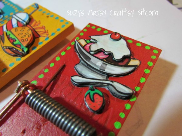
Magnetic Mousetrap Clips
I love surfing the web in search of craft ideas, tutorials and artistic inspiration. Fortunately there are hundreds of wonderful sites with tons of eye candy for an artist with a sweet tooth. Suzy's Artsy-Craftsy Sitcom is such a site, loaded to the gills with all manner of crafty ideas. The Plaster Casting with Sand tutorial really grabbed my attention, as did Popsicle Stick Bracelets and Magnetic Mousetrap Clips. They are wonderful sources of inspiration and appeal to all levels of crafters, from the novice to the advanced, and I know I'll be going back to this site in the future.

From time to time I'll be featuring noteworthy craft sites on my blog in order to spread the artistic wealth around. I hope you like them as much as I do.

Ballo ergo sum
- Gitana, the Creative Diva

Thursday, March 8, 2012

Blockhead Stamps Banner Ad

I'm not one given to placing random ads on my blog so when I choose to do so there had better be a good reason. In the right column you'll notice a new ad from Blockhead Stamps. A couple of years ago I submitted some of my work to one of their creative challenges. I didn't win but the owner liked my work so much she asked if I would be willing to create some pieces using Blockhead Stamps that she could use as part of her display at shows. I agreed and got to choose any stamp set they offered for my work. I chose Inspired by Nature. Here you see a card I make with this stamp set using a bleach technique on watercolor paper. The background was misted with a variety of liquid watercolors, the images were stamped with a permanent solvent ink, then the color inside the images was removed using a bleach pen. After the color was lifted out, it was replaced using watercolor pencils. The butterfly was stamped on and cut from a separate piece of  paper and attached with its wings raised up as if in flight.

The entire exchange with the owner of Blockheads was friendly, supportive and professional and left me with a very positive impression. So when I read on Blockheads' blog page that there was a one in ten chance of winning a stamp just for placing the banner on my page, I jumped at the chance to win a prize as well as show my appreciation for a great company to do business with.

If you haven't checked out the wonderful stamps and other crafting supplies they have available, give Blockheads Stamps a look-see.

Ballo ergo sum
- Gitana, the Creative Diva

Saturday, February 25, 2012

"The time has come", the walrus said...

(Click on photo to see a larger image.)

"...to talk of many things."  Even someone unfamiliar with Lewis Carroll's classic poem, "The Walrus and The Carpenter", has heard those words before. I will do exactly that...talk of many things.

It is with a heavy heart and a tinge of regret that I have made the decision to suspend my craft classes at the senior citizens center. My weekly craft projects have become extremely time consuming and I have other responsibilities that demand my attention. It has become increasingly difficult to come up with a project each week that is simple enough for even the most challenged seniors to complete, interesting enough to hold their attention and diverse enough so that they are not doing the same thing over and over again. Yet there is another, more intangible, reason. I'm feeling jaded and I no longer feel the same anticipation and joy I once did. These are but some of the reasons I must leave my beloved senior ladies.

Here you see a photo of the final project I will be doing with them. It is a card utilizing simple elements on a printed card front. The beautiful designs on these cards make simple die cut shapes and a decorated garment tag take on a more sophisticated look. This will be one of those projects where the ladies will get to choose their own pieces as opposed to having me create individual kits for them. The cards are double sided with an ornate design on one side and a more subtle and subdued pattern on the other side, giving them two options to choose for a card front. The embellishments will all be placed on the table for them to choose from and if I know my ladies they will all be choosing a different mix. With this, their final craft project with me, they will be allowed to demonstrate their own personal creativity and flair. I, for my part, will be photographing them as usual, capturing their moments of cooperation and their smiles.


Ballo ergo sum
 - Gitana, the Creative Diva

Saturday, February 11, 2012

Going with the Flow

(Click on any photo to see a larger image.)


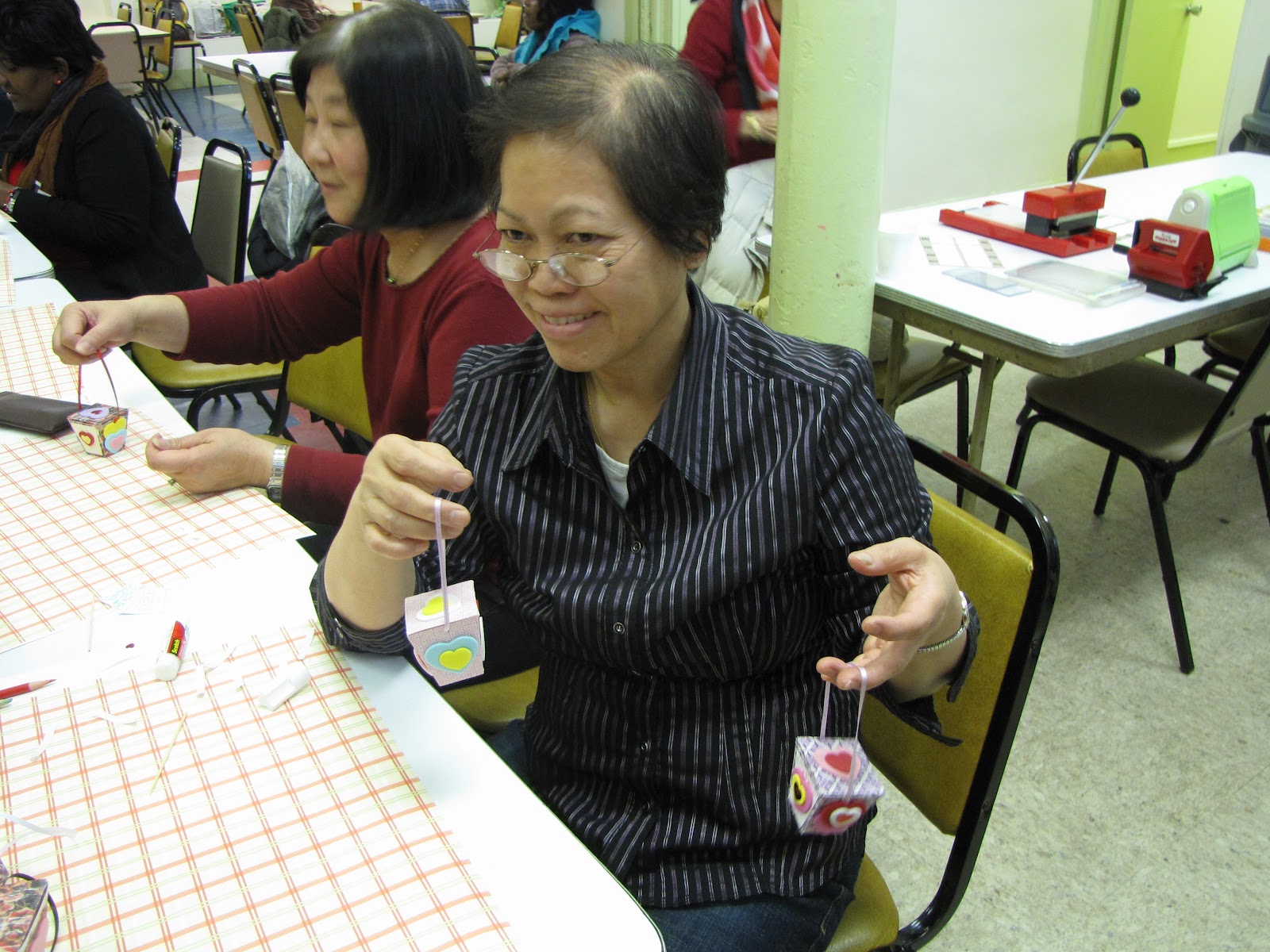
The final Valentine's Day craft class took place at the senior center this week and once again I decided on a bit of a departure from the norm. I was going to have the ladies craft little treat boxes shaped like miniature Chinese food take out containers.
Although we have made little treat boxes before, this time I left a lot of the work up to the seniors. I cut out all the pieces as usual but I didn't package everything into neat little kits. Instead I spread everything out on the table in boxes and let them choose whatever pieces they wanted to decorate their boxes. I also brought along a few "toys" for them to play with -- embossing machines and embossing folders. This allowed them to press raised designs onto paper panels that they then glued onto the sides of their boxes. I demonstrated how to use the machines and also showed them how to color their embossing with the side of a colored pencil to highlight the raised designs. I provided them with charts illustrating the available designs they could choose from and then I let them loose.
Oh boy, did they get a kick out of that! I thought they would be a little annoyed at having to get out of their seats and walk over to the adjoining table where the machines were but not only did they not get annoyed, they were having a ball choosing designs and using the machines. A few of them were very enthusiastic about the project. Fortunately I had made double the usual number of projects because the boxes were very small and because I wanted them to make one for themselves and another one to give away to a someone they loved. And, of course, what is a treat box without some treats? When they completed their boxes, I filled them with candy! The class lasted much longer than the usual 45  minutes to an hour but no one seemed to mind a bit, least of all me. 

The preparation for this class took quite a lot of time and those embossing machines and supplies were REALLY heavy (I needed a rolling bag to carry them) but we had such a good time that it was all worth it. As the class was ending, one of the ladies gave me one of her completed, candy-filled boxes. I thought it was such a sweet gesture and it gave me a big smile. 

After each class, it is my practice to take the prototype I create for the project and place it in the display case with the other class projects. In this manner there is a constantly changing display with older pieces being replaced by newer ones and I get to look over all the work we've done in the past. This week when I added to the display, something had changed. It was as if I was seeing all those pieces for the very first time through a new set of eyes. I was taken aback by the true beauty of it all and I had to hold back emotional tears of joy. 

It's funny how you can be so close to something that you don't really see it. 


Ballo ergo sum

- Gitana, the Creative Diva

Wednesday, February 1, 2012

An Unconventional Valentine's Day Card

(Click on the picture to view a large image.)
2012 - a dramatically different color scheme
When you think of Valentine's Day, you think of pink and red hearts, right? Yeah, me too, but this year I wanted to do something a little different for my seniors. Our Valentine's Day projects for the past two years, as seen below, have included the mandatory red and pink hearts. This time I wanted to give an unexpected twist to our craft project. While this year's card sports the obligatory hearts and flowers my ladies know and love, the color scheme is anything but conventional. Inspired by a beautiful piece of specialty paper in shades of turquoise and purple , I designed a card that really played up those colors. I will admit that, at first, I wasn't too thrilled with the way this card was turning out but the more I worked on it, the more it grew on me and now I'm very pleased with the final outcome.

Our very first project from 2010
2011's hanging ornament
The colors are not the only things different about this card. You can't really tell from the photo but this is not a foldover card, it's an insertion card. What I mean is that there is only a front and a back to this card, like a postcard. It doesn't open up. You have to turn it around to see what is written on the other side. This will be a bit of a departure for these ladies accustomed to the more conventional type of card.

For this project I had my DrawPlus graphic software and my eCraft electronic cutter working overtime. The heart is crafted of four different layers stacked upon one another. Each of these layers had to be designed and cut separately. It took quite a few attempts to get the lighter blue trellis-like layer to cut correctly, after which I had to manually poke out all the little holes in between the mesh. Once the heart was completed, cutting the rest of the card elements was a piece of cake. The tiny tag was just the perfect size for a kiss print rubber stamp that I've had for the longest time. I deliberately left off any overt references to Valentine's Day because I wanted this project to convey the universal aspect of love over the celebration of one calendar day. This card could just as easily be used to congratulate a newly engaged couple or be sent as a quick hello to a cherished grandchild. Although I admit that the swirls and flowers lend a very feminine air, the color scheme would suit a young man. I'm sure the ladies will love it.

Ballo ergo sum
- Gitana, the Creative Diva